
A new logo for the National Film Registry was long overdue. This is one of the central reasons we decided to choose this Program for our campaign. The current logo for the National film registry is pictured below:

It does a beautiful job of conjuring images of stylish parachute pants and remarkable innovative VHS tapes. Fortunately for our purposes, this was due for an update. In considering what the aesthetic of our new Registry would look like, we discussed a lot about our target audience. The main shortcoming of the current logo is simply how boring it is.

A major flaw of the current NFR logo was its lack of foresight. Once you know it was made almost 30 years ago, its very hard to forget. The color and line and the use of the eagle was a little bit trendy, and so it didn't age well. It was not timeless, it was trendy. The gradient color was no doubt beautiful in 1989, when it was conceived, but lacks a clean, simple design that is prevalent in media consumed by younger audiences:


Ideally, the logo becomes an icon by which people can recognize your brand without the need for the text. Just like Facebook, Twitter and Tinder, we can all recognize the logos without the actual titles of the platform. It was pop culture imagery like this that helped to inspire the simplistic logo for our new national film registry.
When considering the logo for our National Film Registry, I thought a rose would be appropriate, since it is a common practice to throw or gift flowers (traditionally red or pink roses) to a performer after a great performance. The association there of course being that the movies included in the Registry are of a rare high quality.
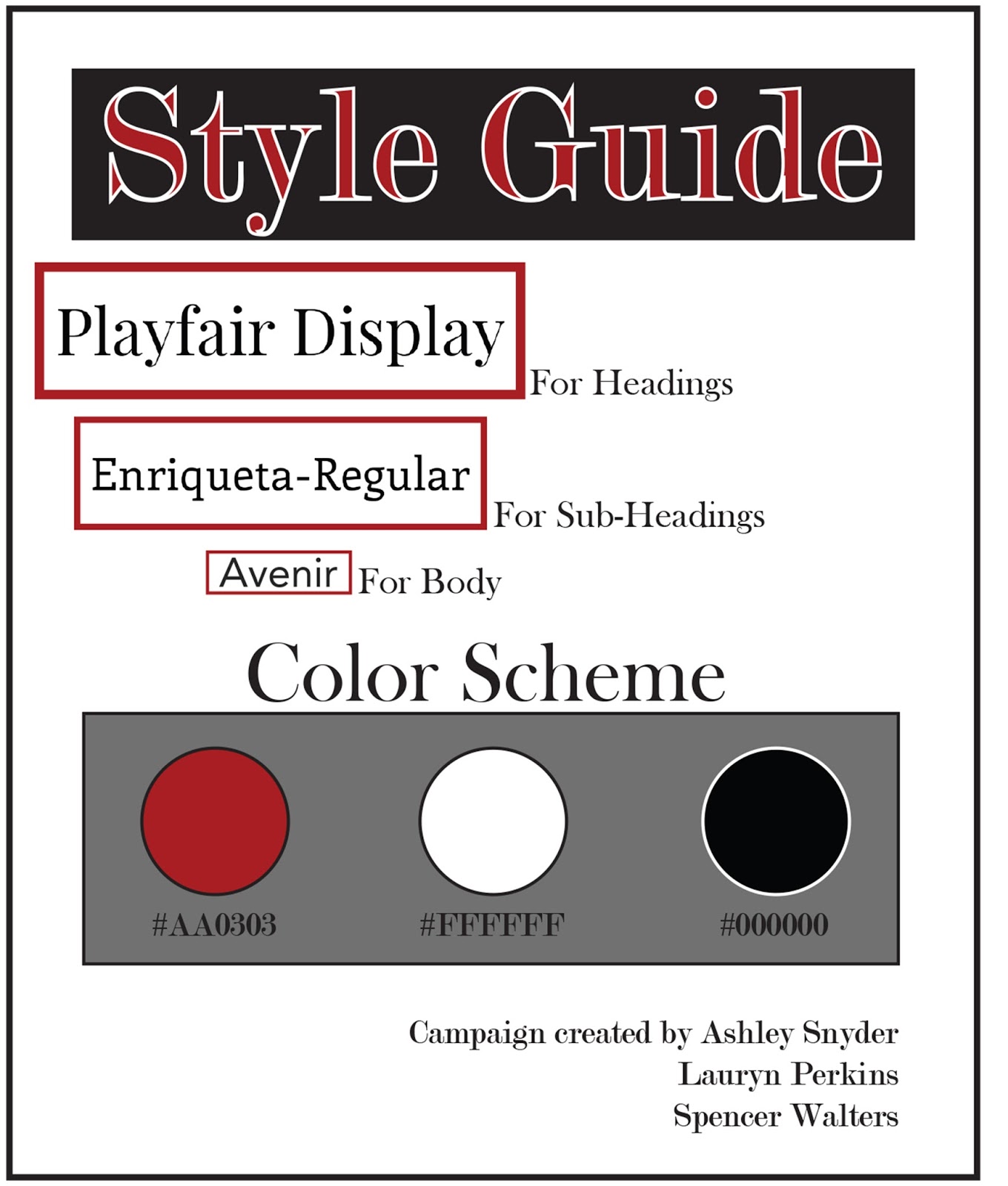
The typeface for our style guide was primarily decided by what was available on our website software. We had the discussion early on that we would not be using script fonts in this campaign, but rather we would adhere to either old style/transitional fonts or modern, Avenir art-deco style. Personally, I am a fan of serif fonts, so Playfair was right for me. The other text on here is Modern no. 20, which is what we ideally would have used for headings, I think, but we were confined to what we could find on Wix, so we came as close as we could.
From early on, we decided on a black and white theme with an accent color would be the most classic and dynamic design. We first decided on a vintage yellow color, bitter lemon, inspired by a line of converse shoes,

But after some thought, we decided to go a little more traditional. We wanted to avoid being trendy, and instead kept an eye on longevity, trying to make our brand last as long as possible before a re-branding is due.
Just before we came to the final decision, I tried to make the red a brighter shade, but for some reason any shade brighter than the current one would evoke images of Nazi propaganda, so it was important to keep in mind the psychological context of people looking at this logo. We want people to like it, not fear it, and hopefully we struck a nice balance.
No comments:
Post a Comment